Zevia
Overview
Zevia is a natural beverage company specializing in soda, sparkling water, energy drinks, mixers, and organic tea. They currently sell only on Amazon, and hope to shift that business with their new eCommerce presence.
My role in this project was the UX design of the shop all page, product listing page, and product description page.
The Goal
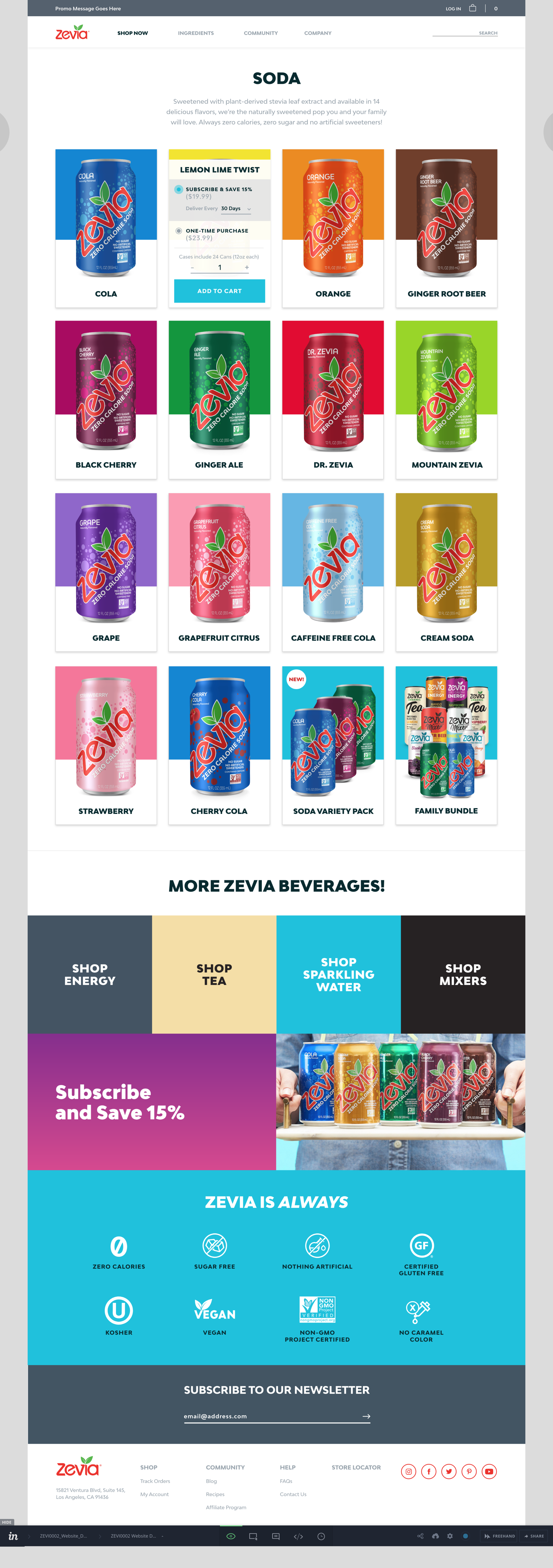
The business goal was to incorporate a subscription functionality to create customer loyalty and increase sales. The client wanted an engaging, dynamic site. They also wanted to allow the ability for customers to order from the product listing page.
The Problem
This project had a limited timeline, without resources for thorough usability testing or user research. We also needed to come up with a sophisticated solution for customers to “add to cart” from the product listing page, while giving them the option to select from various flavors, subscription frequencies, and quantities.
Here are some screenshots from the current experience:
Using best practices, heuristics, and a stakeholder discovery session, we were able to identify pain points and opportunities for improvement within the current site:
Key UX Pain Points & Opportunities
The brand’s value proposition & competitive edge is not clearly displayed
Product listing page and PDP need to be shoppable, while continuing to display educative content
We know customers are motivated by health, low sugar content, and natural ingredients, and leveraging those factors of credibility will help to maintain consumer trust
Bubbles on the PDP are overwhelming and cause additional friction to the experience.
Overall, the site lacks hierarchy and clear pathways for purchase
We need to shift primary actions of “finding a store” to buying products
Ideation & Wireframing
User flows and content placement was worked through with quick sketches, that became realized through the wireframing phase.
During wireframe ideation, the visual design team gathered inspiration, and UX/Visual Design collaborated on the direction, in order to wireframe from the agreed-upon creative lens. This created an efficient process as styles were defined prior to functional design.
The Solution
The redesign for the Zevia eCommerce experience emphasizes subscriptions, healthy ingredients, and focuses on an intuitive experience that makes shopping for products dynamic and engaging.
The experience redesign included:
A simplified means to navigate between flavors across same product type (i.e. “soda”)
Clear hierarchy and paths to purchase the product - either via hovering over the product container on the PLP or by discovering my info before purchasing on the PDP
A default subscription selector, with the ability to change frequency. Emphasis around the subscription discount in theory will encourage users to keep the subscription option selected
Review stars above “add to cart” help to ease friction around completing the purchase
Ingredient / Health icons below the product image area maintains credibility and trust for users
The New Experience
The new experience combines Zevia’s fun personality with a clearer hierarchy around purchasing the product, ingredients and non-ingredients, and intuitive functionality to select alternative flavors.


