
Case Study
Nordic Naturals

Overview
Nordic Naturals is a top-selling omega-3, probiotic, and vitamin supplement company known for its pure and natural process for the creation of their product. I was the Lead UX Designer with Digital Operative for the strategy & redesign of Nordic Natural's online consumer store, with a goal of increasing online sales for their products.
Through a discovery and UX process, we simplified the information architecture and designed a seamless user experience to ease product findability for Nordic Naturals' core audiences.
Understanding Consumers
Through the engagement of a comprehensive Discovery phase, the DO team grew their understanding of Nordic Naturals’ core values, competitive landscape, customer needs, and preferences.
We found that the primary, typical consumer types are:
Affluent wellness shoppers concerned with quality & sustainability
Amateur and pro athletes
Pet owners
Personas were also developed via a general spectrum based on familiarity with the brand: vital for life, good for healthy, and casually aware.
In the process of conducting usability testing, competitive analysis, and a heuristic evaluation of the current website, the team uncovered various pain points within the current experience as well as opportunities for improvement and innovation.
Here are some screenshots of the current experience:
Key Discoveries & Opportunities
In usability testing, participants struggled to recall the main purpose of pages during 5-second tests.
We found an opportunity to make copy structure and site structure more digestible throughout the experience, in order to bring forward Nordic Natural's value and competitive edge
The site lacks a clear value proposition for customers
Focusing on a message of "why" consumers need these products will help to create urgency and interest
In usability testing, participants struggled to find products and categories related to a particular health interest
Many visitors are looking for something that matches a specific set of predetermined benefits, and there is an opportunity to make the identification of product benefits and product differentiation accessible to more uninformed users (i.e. how many omegas would someone need?)
60% of visitors use search, and visitors overwhelmingly select “products” from the navigation on the current consumer homepage
We know that users are motivated to find and view products as soon as possible, and focusing on providing pathways that match their motivations will allow users to find more relevant products
Users unanimously trusted the site due to its wealth of scientific information presented on “Why Nordic Naturals” and “Why Omega-3s” pages
The solution of the redesign must maintain the level of trust and credibility while infusing simple, fun, and engaging elements to ease the product selection process and increase conversions.
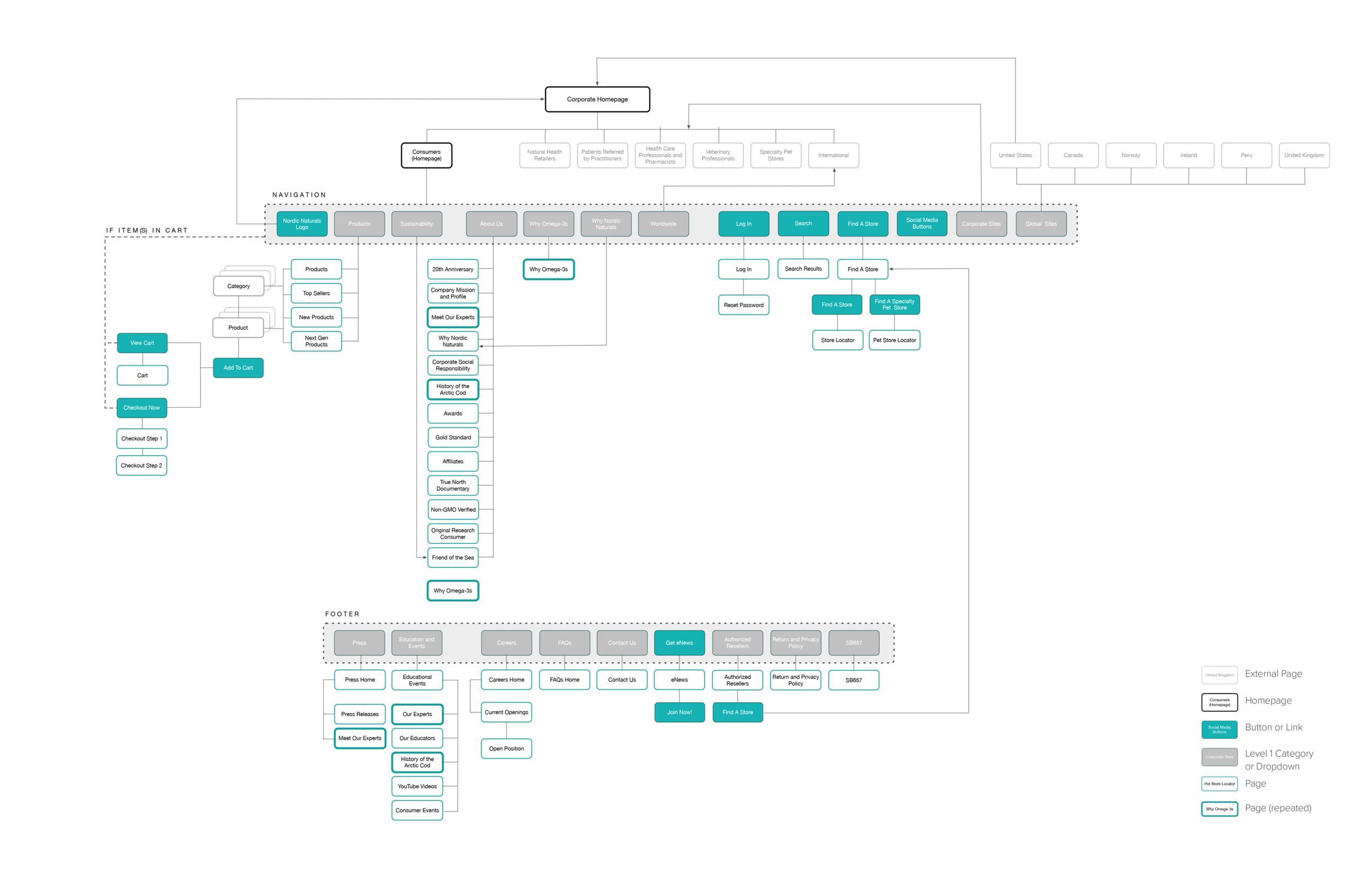
Information Architecture: Site Structure
The IA process began with both a site map and content audit, in order to analyze the current site's structure. Using the site map, we were able to determine moments of cognitive overload in the experience, particularly where users became lost. We also uncovered instances where the user is forced to enter a barrier before arriving to an intended page, as well as opportunities for page combinations. The goal is to relocate existing content logically and strategically within the site structure so it is both digestible and accessible for customers.
This is the existing site map:

content audit
Using data in auditing the content of the current site, we were able to better evaluate repetitive pages, pages with minimal content that could potentially be absorbed into other pages, and understand unique page views that help to inform users’ motivations when visiting the site.
We used unique page views as a vehicle for determining which pages users are motivated to see, as well as opportunities to highlight value on pages that are less interacted with by merging them with related, higher viewed pages.

proposed categorial content clusters
We found that many pages were underperforming, had dead end flows, and determined how the content could be merged with another page, resulting in 301 redirects.
We developed a content strategy that organizes all current informational pages of the site into (4) categorical clusters:
About
Process
Health
Learn.
As the science and effort behind Nordic’s process is not currently easily accessible or communicated the the user, having a separate category for this information clearly highlights the purity and science behind the product.
Here are some process images from organizing the site content:


Looking further into the pages within each cluster, pages with related content were merged together into a single page.
The strategy for this merging was influenced by:
Related content
Amount of content
Number of pages views in a 2-month period of time
This strategy also allows valuable information on less-viewed pages to now be more accessible for the user.
The new, proposed site map simplifies the experience and allows for customers to easily navigate the website, search for products, and become better informed about both their health and the purity of Nordic Products, ultimately creating a more fluid and clear user flow:

The site structure also offers a solution that matches motivations of each persona group, leading to a goal of increased product discovery and better informed users. The visual site map is accompanied with a page numbering system and clear designation of URL structure.
The redesigned navigation is no longer a dump for information, but a tool that helps users better complete their tasks.
Information Architecture: Product Structure
We reviewed the current categorization of products available to the consumer, as well as products that exist in multiple categories. We determined that the current categorization lacks clear hierarchy, causing an overwhelming and anxious experience for the user to find what they are looking for.
This is the current product structure:

The proposed product categorization prioritizes products based on shopping preferences as found in discovery phases, and provides a clearer choice for users based on type of product or health interest:


We categorized products to create 2 clear paths for navigation:
By Type
By Health Interest
These two paths better align with how users are motivated to shop.
We also broke down product attributes and taxonomies, to be applied to products and used as means for the user to filter and sort through products within the category pages.
By providing hierarchy within the product structure, users are able to access products through a clear process, with additional subcategories included for unique product breakdown.

proposed product structure
Wireframing
The information architecture strategy was carried through in the wireframing process, where we visualized the solution on desktop, tablet, and mobile breakpoints, beginning with iterative sketches.
The resulting wireframes intend to reduce friction by providing a smooth customer journey from first visit, to education, to final purchase.
Product listing pages provide the ability to filter products based on format, and product description pages serve to better configure product through various attributes. We also proposed the addition of a cross-selling feature upon adding a product to cart, enticing customers to purchase products "sets" based on similar flavors / attribute types.
Desktop wireframes:


Tablet wireframes:


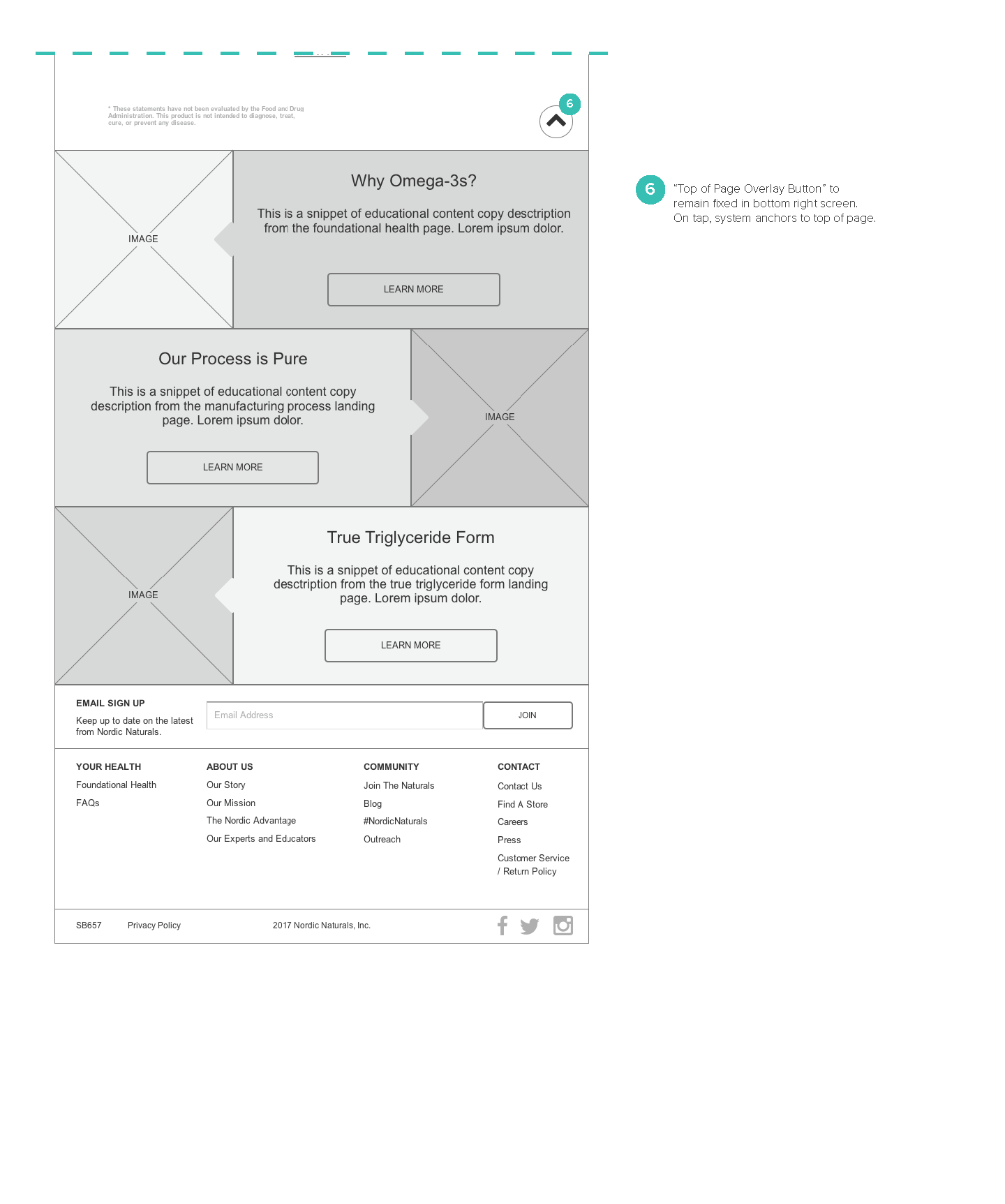


Mobile wireframes:


The New Experience
The new experience educates consumers by guiding them on the right path to purchase, supporting their health needs and goals. Information is presented in a delightful manner, and scientific qualities of supplements are simplified for consumers to understand through visuals, without discrediting the quality of the product.


Results
Since the site launched in April 2018, there has been an average order value increase of +107% and conversion rate increase of +12%
Note: our internal team was not responsible for the development nor involved with post-design collaboration with stakeholders