
Case Study
Taskly

Overview
Taskly is a project management application designed during the CareerFoundry UX Design course, an immersive online bootcamp. The full process is outlined below, and takes the project from inception to complete prototype.
Role
My role in this project was, as a 1-person team, to carry out the creation of Taskly beginning from initial conception to completion of a production-ready design. This was done by implementing a three-phase process of research, design, and testing.

Part 1: Research
The first step in Taskly's creation was lightweight research, in order to validate the MVP for the application and determine a design direction by understanding the users' needs.
This included an examination and analysis of both Taskly's competitive market as well as its potential ideal users.
Competitor Analysis
A competitor analysis was conducted in order to compare some of the top project management apps in the market, and evaluate their strengths and weaknesses in order to:
Establish Taskly's competitive edge
Define the scope of Taskly's key features.
The result of this analysis?
An app like Taskly has the potential to fulfill the needs that users have better than competitors.
Users need to be able to both brainstorm within the app as well as organize their thoughts, ideas, and deliverables into a cohesive product package
It should make working on a team easier
The interface should not let the user feel overwhelmed
Team communication within the software.
User Surveys and Interviews
After gathering market research, and started internally visualizing what Taskly could be, I conducted user surveys and interviews.
Using surveymonkey, a sample of potential users answered questions- the goal being to gain insight on the problems users face when working with a team or client. Isolating this problem would provide a focus for Taskly's overall concept.
The target audience included employees at both large and small companies, freelancers, and students- specifically those working within project teams.
The most revealing question was regarding the problems survey-takers stated to have during team collaboration.
The top (4) problems were the following:
Unorganized tasks
Weak communication
Lack of hierarchy or prioritization of tasks
Unequal distribution of responsibilities
The user interviews, a one-on-one discussion with potential users, reiterated the problems listed above, and were validated as issues that many users face. The interviews also revealed additional discoveries including the need for:
A note-taking tool
A way to filter tasks
A way to organize tasks
Show deadlines
Instant message teammates.
The Problem
The biggest problem that users face in team collaboration and current project management software is the ability to organize tasks, the feeling of anxiety by the amount of tasks, and the distribution of responsibilities for tasks.
The Solution
Taskly’s goal is to offer a way to flawlessly organize tasks and ease task organization. Productivity tools will allow the user to message, save, and schedule with their teammates. Taskly's mission is to provide a way to collaborate at convenience to make productivity happen whenever, wherever.
User Personas
The personas below were created as based on real people who were observed in surveys and interviews. These personas serves as prototypes moving forward into the design process for Taskly, and offered insights on how the product could target towards their needs.


Task Model
The task model below represents the users' process for creating a new project. The design of the experience fits users' expectations, taking into account three behavior types: direct connection, controlled evaluation, and complex evaluation.

User Journey Map
The journey map was created to outline the thoughts, feelings, and corresponding actions a user may go through when interacting with Taskly, helping to identify opportunities, pain points, and calls to action.

Part 2: Design
Based on the discoveries found through user research, the design phase focused on the problems revealed, unfolding a user-centered approach for moving forward with the content, structure, and visual design of Taskly.
Information Architecture
Using a method of card sorting, participants were asked to categorize cards with items including the features and functions of Taskly.
Information was distilled and organized into the map below, revealing the structure and hierarchy of the app. The core of Taskly is the "hub", the activity feed the user is directed to once logged in. From their hub, the user can access their profile, calendar, messages, and projects. Each of the user's projects will consist of a series of features: tasks, team, ideaboard, client, files, timeline, discussion, and notes.
Paper Prototypes
Thinking through the user flow, I first iterated rapidly through thumbnail sketches, making the flow efficient and reduced to an optimal number of steps. I then transferred those iterations, adding more detail and content.
Because of Taskly's value proposition to be used anywhere and anytime, it was crucial to design the mobile UX first, keying in on Taskly's core. Many of Taskly's users would depend on the mobile capabilities of the app if they are traveling, or need to stay on track with projects when not in the office.


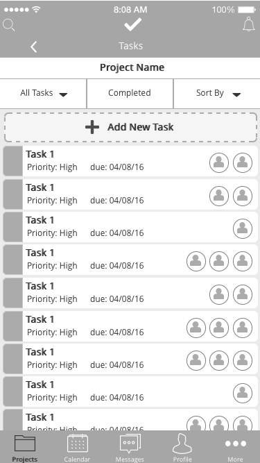
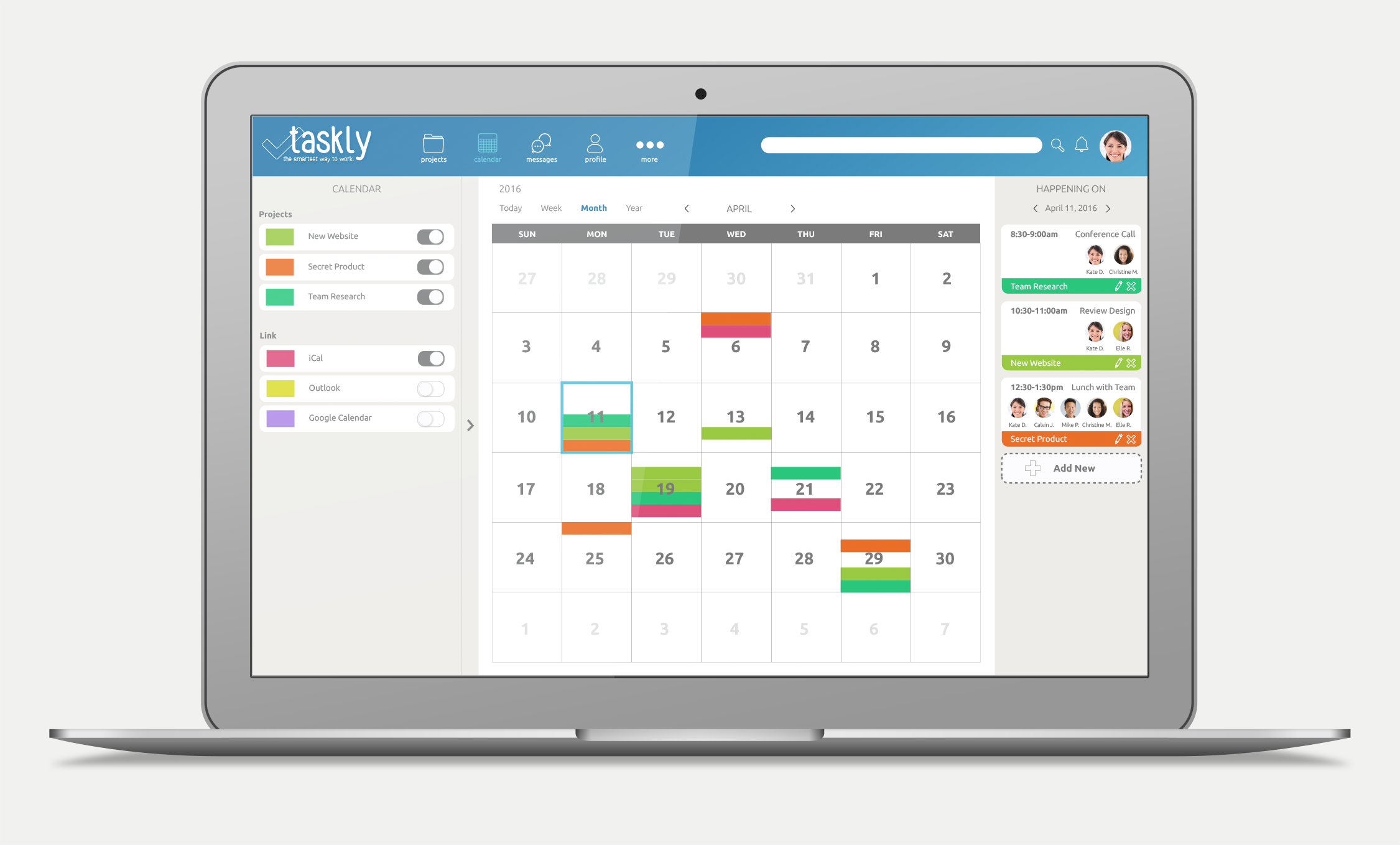
Wireframes
Using UXPin, I created wireframes beginning with the mobile design, then scaling up to tablet and desktop screen sizes.
Desktop:


Tablet:


Mobile:


User Flow
As the ability to create a new task is one of the core functions of Taskly, it's crucial for this process to be intuitive to the user and supports user needs.
The flow below shows the initial step-by-step process of adding a new task, which is later tested with users through both non-interactive and interactive prototypes to determine the flow's validity.

Usability Testing: non-interactive prototype
After defining the user process, the goal of this testing was to evaluate the usability of the design, ensuring that users would easily be able to create a new task. I created paper prototypes of the wireframes, and set up a test with users who represent the target audience for Taskly.
Usability Testing: interactive prototype
Using InVision, I created an interactive prototype and used it for a second round of usability testing, with a different sample set of users. The purpose of this test was to identify common pain points between users, as well as recognize any usability issues to resolve before moving into visual design.
The Results
Positive feedback:
Users were quickly able to locate the "add new task" button
Users also appeared satisfied upon seeing the "task added" success dialogue box, with ease to either return to their task list or add another task.

Modifications:
Some users appeared slightly overwhelmed upon seeing the form page for adding a new task. The intention was that this would give the user more options, however it may cause the user to bounce after feeling anxiety from the long form.
The solution and modifications to the form page includes smart defaults for the dropdown menus, allowing for a simpler and more inviting experience.

Wireframes Part II
After conducting usability testing and analyzing results, the mobile, tablet, and desktop wireframes continued to be refined and annotated for visual design production and later development.


Visual Design
The UI Kit for Taskly reflects the goals of the product by creating a calm, minimal, inviting, and trustworthy app to appeal to its diverse market of companies, students, and individuals. The UI assets were integrated into the final wireframe designs.


Part 3: Testing
Using the UI mockups, a series of tests for Taskly were run on a sample set of users, using Verify app.
The tests both affirmed the usability of the design, as well as revealed new discoveries.
A/B Test
Two variations of the sign-in screen were created. With a goal of increasing the number of signups, the test would to aim reveal which background would be more inviting for users: white or blue.
Results:
The majority of users, 69%, preferred the sign-in page variation with the blue background. They felt that it was "calming, easier on the eyes, and modern."


Multi-click Test
A multi-click test was also conducted, with the goal of validating the user flow for adding a new task.


A vast majority, 92%, of users performed this task successfully, confirming Taskly's ease of usability and meeting its users' needs for task creation.
With the success of the various tests, the final design can move forward into development with confidence.
