Case Study
Paper Mart

Overview
Paper Mart is an eCommerce enterprise that sells paper, packaging, craft items, and a variety of goods for both B2B and B2C customers. There are two primary components to the experience: shopping for products and customizing products. While working with Digital Operative through a series of workshops, research analysis, and evaluation of the current site, we strategized a site redesign and prioritized the most impactful initiatives to address including navigation, site structure & IA, product listing page, product description page, and customization tool.
Discovery: Customer & Competitor Landscape
Because of an almost 50/50 split of B2B vs. B2C customers, the very basic segmentation of Paper Mart customers can be defined as motivated to make larger quantity vs. smaller quantity transactions.
Through analytics and market research, we found that the customers are predominantly (75%) female on both desktop and mobile devices., motivated by:
Finding deals & enjoying the feeling of getting a great deal
Saving time & being able to skim information quickly to find products and discounts
Consistent service - many of Paper Mart’s customers are loyal ones
We also found that there was a majority desktop audience (>70%).

Additionally, We gained insights on customer motivations based on search terms and page paths. Our solution will ease the experience of locating products and product types that users are highly motivated to see.
Competitive Analysis
During the discovery phase, we conducted a competitor analysis to better understand the industry landscape. We looked into what each brand is doing in their respective spaces through a variety of factors including site content, structure, usability, features, visual language, etc. We leveraged competitor strengths to be used for recommendations for the redesign.

Some key takeaways included the display for product ordering tables for B2B customers, search logics, filtering options, customization tools, and overall site treatments.
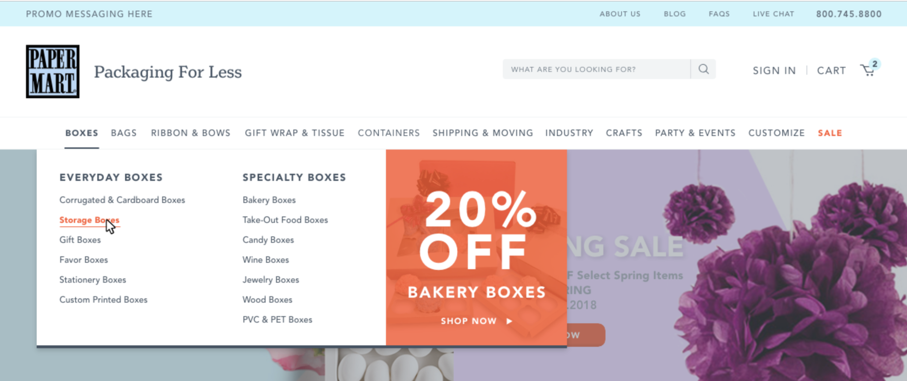
1. Site Structure, IA, & Navigation
Pain Points
• Due to the sheer number of products, the navigation can feel overwhelming for users
• Alphabetical organization does not allow for the most ideal distinguishability between product types and can add cognitive overload for user to visually locate product easier, vs. ordering the categories based on popularity/ user motivation
• Overall, the experience is very cluttered and does not provide clear visual paths or hierarchy

screenshot of current navigation
Additional Research
In order to determine successes and opportunities for improvement in findability of products, we set up a test where participants were prompted to select where they would find certain products or product types, based on the structure of the existing navigation.

The test resulted in a validation for findability for many products within the existing navigation structure, though also revealed some gaps- particularly the tasks that required finding the label gun and sparkling tulle.

By analyzing where participants went down the “wrong” path, we are able to identify areas of opportunity for the structure of the navigation, as well as product hierarchy.
Key Learnings
Customers are more likely to find products more directly when navigation label supports their motivation on a purpose level
Customers benefit from various options to arrive at product, and will select based on label that best resonates with them, or that they notice first
Even if an item can be found in multiple categories, customers will click on the most obvious one that they feel would guarantee to contain that item
There needs to be a more obvious way to find “business supplies”
Solution
In analyzing the current site map, we found that the overall site structure is clear, though product structure on category listing pages can cause confusion as an overall hierarchy is not in place. Using the findings from the tree test, we refined the site map that later informed the site’s navigation.

Product categories are organized to reflect user motivations
Navigation labels are informed by data found during tree testing, including :
a terminology change from “ribbon” to “ribbon & bows”
combining “gift wrap” and “tissue”
a terminology change from “tins/jars” to “containers”
adding “business supplies”
a change from “shipping” to “shipping & moving”
a change from “parties” to “parties & events”
Navigational feedback is provided to reflect the active page or category that user is within, to help them from being lost in a very deep structure
Used image assets in the navigation menu to drive promotional content

proposed navigation wireframe
proposed visual design
Additionally, due to a large % of visitors utilizing search, we recommended a search functionality that will guide users to clear paths that dynamically populates recommended products and categories.

2. Product Listing Page
Pain Points
The product structure is very deep, and there is not a proper visual distinction between “products” and “subcategories” on the listing pages
Filtering logic doesn’t relate to product attributes and there is not an intuitive way to narrow within the products shown
Price structure is confusing with large ranges and no units shown (i.e. “each”, “case size”, etc.)
Relevant configuration options are not displayed (i.e. color swatches)

current product listing page

current containers on PLP
Solution
The proposed redesign for the product listing page addresses the current pain points and provides a usable solution.

• The filtering logic is clarified and pertains to products within the respective categories
• The only “containers” shown are those as products. Subcategories are listed as a narrowing option in the sidebar
• Utilize “sale” and “new” tags
• Product containers display pertinent information such as # of colors available, if product is customizable, minimum case size, and minimum price per respective unit
• We also recommended a toggle switch for customers to easily view high quantity vs. low quantity options. This tool will be very helpful for B2C users who would like to purchase small quantities.
3. Product Description Page
Because of the diverse range of products, both simple and configurable, we needed to create a universal PDP that maintains consistency throughout all product category types in order to ease the shopping experience for customers.
Pain Points
There’s no easy way for user to view all color/size options available without confusion, and no intuitive way to customize applicable products
Product images don’t utilize zoom - many products are finely detailed and being able to see them with ease will provide significant value for customers
Pricing and discount messaging is not clear
The case size defaults to larger sizes, which is a pain point for B2C customers
There’s no hierarchy or path around the decision points pertaining to feature/attribute selection, or adding to cart

current PDP
Solution
After performing a series of sketches and considering best practices for a universal PDP, we designed an intuitive solution that clarifies the product selection experience.

The final price isn’t displayed until users have completed their selection, and price updates dynamically through each step. We also leveraged DIY videos for products and recommended UGC to increase customer engagement.
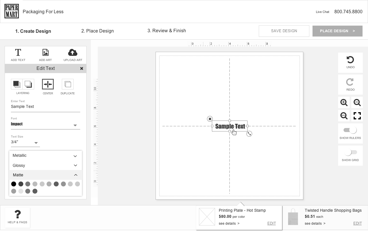
4. Customization Tool
The customization tool is a crucial element Paper Mart’s success, as many customers use this for their business collateral. Optimizing its flow will not only help current customers but will also leverage new customers to utilize the customization tool and reorder.
Pain Points
• User must select size in order to see price for that selection does not occur until next screen
• User is forced to checkout if there are items in their cart
Users are forced to login or create an account in order to start designing, creating a barrier in the experience
• Too many steps must occur before being able to design or upload design
• Process is not clear as CTA buttons do not provide hierarchy in experience

The experience of arriving at the tool is a series of pages in itself, though here is a screenshot of the current customization interface:
User Flows
We analyzed the flow of the current experience to identify any additional pain points and begin to be able to map out areas of opportunity to create an experience with less friction.

We then re-worked the flow for a more efficient way to get the user to start designing or upload their designs, in order to reduce barriers in the experience. We had some technical limitations where the user must select the product before customizing, however we are recommending removing the need to login to begin designing, as well as the need to checkout with existing cart items:

With the new flow in mind, we redesigned the customization tool interface leveraging overall process paths, helpful tips, and an easier way for users to manipulate their designs.