
Using Web E-Commerce Trends To A UX Advantage in 2018
(Written for Digital Operative's blog. View the original post here)
Let’s face it: trends are constantly coming and going. In the never-ending competition to stay current with design shifts- is there a cost for users? When it comes to eCommerce, every unique experience, from the site structure to the micro-interactions, must keep customers forming a bond, advocating for their brand, and returning for more. We’ve looked at some popular trends from 2017, and discovered sites that use them to their advantage to likely create a better shopping experience for their users.
Long Scrolling Pages
It’s tempting to want to purge content when looking at the design of a long webpage, assuming that there is no way the user will make it down to the bottom of the page. The truth is, user habits are changing. Because of the inevitable scrolling that occurs on mobile sites and apps, users are scrolling more on desktop experiences as well, regardless of device. Thus, we are starting to see more and more sites capitalizing on this behavior. Many social media sites such as Pinterest, Instagram, and Facebook utilize infinite scrolling, where users could potentially scroll for hours, essentially trapped in an abyss of endless content until they make a conscious decision to leave. Because the content is structured appropriately in these cases, users become highly immersed and engaged.
This pattern is starting to occur in eCommerce as well, where pagination is eliminated on category pages. Though the scrolling will never be truly “infinite”- the feeling for the user is similar to that of scrolling through a Facebook news feed, though not nearly as dark of a pattern.
Patagonia’s category pages, for example, lack pagination, and an infinite scroll functionality is utilized, where additional products automatically load in bundles.

For users who are in the “product discovery” phase, the content remains interesting to them and they are mentally immersed in narrowing down their decisions and determining their preferences, without having to divert their attention and click onto another page.
A long-scroll trend is also seen on many product detail pages, for example Apple’s product page for the new iPhone X.

Although the page is incredibly long, I found myself unable to leave the experience and continued to scroll to the bottom. A long page works in this case not just because it’s Apple, and let’s face it- Apple can do anything, but because the content is strategically exposed. The page works by telling a story about the product and its features, and content is broken up with animations, high-quality photography, copy, bold titles, and calls to action, keeping the user in a flow of engagement, and curious to see more. Apple could have easily found a way to consolidate the product’s features into tabs or sliders, but there’s a reason they chose for users to experience everything in a single, fluid, scroll.
Another example of a long scroll page is Frederique Constant’s smartwatch.

The page contains a lot of content, so the a progress bar on the left side that reflects the user’s location on the page. This is helpful in eliminating any anxiety because it gives the user an idea of what to expect. A similar strategy occurs on the “features” page, with a fixed side navigation within the page that provides feedback for the user by calling out the active section.
The downfall of long scroll pages is, without a scroll mapping software embedded in the site’s code, it’s pretty hard to measure.
Scrolling gives users the opportunity to feel like they are in control and harnesses their focus, whereas clicking creates a pause, both in the interaction between the user and interface as well as within the user’s brain. As long as content remains relevant to them, users will continue to scroll without consciously thinking about it. If and when content becomes irrelevant, users are more likely to leave the page, or site altogether. When it’s done correctly, scrolling keeps the user entertained, and the longer one stays on a page, they are more likely to convert.
Smooth Animations and Narratives
The secret behind many great designs and successful products often has to do with telling a captivating story. In the web design world, we’ve been seeing more parallax scrolling, where the screen stays static as elements move both up and down into the user’s frame. This concept is great for guiding the user on a very specific path, and drawing them to focus on specific elements that move into their eye-path.
Campaign uses smooth animations to their benefit, to explain the assembly process of their product and the simplicity of its design. It’s almost effortless for the user to understand this message and the simplicity of the assembly of a chair, as it occurs visually with just a simple scroll of the mouse.

“About” pages are typically where companies have an interesting story to tell, being a great way to implement a narrative strategy. Bellroy does this on their “Our Story” page, with a progress bar to guide the user as they scroll.

Injinji, which was designed by the Digital Operative team, takes advantage of storytelling through smooth animations as well. On the “About Us” page in particular, content slowly loads and appears on the screen as the user scrolls down.

This interaction feels fun for the user and gives them a sense of accomplishment with little effort.
With a lot of content or information, smooth animations could start to become confusing for the user, as it takes them longer to find the exact information they are looking for. It’s best to use this method sparingly, to tell the story in a very meaningful and purposeful way.
Autoplay Videos
There’s almost nothing more embarrassing than opening a web page and unexpectedly hearing unfamiliar sound start playing, in front of all your coworkers. Even with the headphones in- it’s still pretty jarring when it happens without notice. Despite this obvious annoyance, more and more companies are seeing the benefit in displaying videos with autoplay turned on.
People are more accustomed to watching videos on homepages especially, so brands are taking advantage knowing this. If sound is auto-playing, it either needs to be: a) not distracting- which is a somewhat subjective form of measurement, or b) the content must need sound as part of the experience. This is hard to pull off.
VeraWang currently uses an autoplay video on the homepage, with sound, in order to generate a feeling of luxury, quality, and elegance for their brand.

On hover, a “pause” button appears, allowing users to stop the video. The autoplay video could provide a few possible effects: either a) users are bouncing, b) users are engaging with the video, or c) users are redirecting themselves to another page on the site immediately- most likely the users who know what they are looking for.
Bump has an autoplay video with sound as well, however rather than including it in the hero, it happens below the fold.

Though the video demonstrates how the product works and provides valuable content for the user, the user is completely unexpectedly greeted with sound once they scroll down to that section. Though this is not ideal, it helps that the video does not play until the user arrives to that section, at which point the user is aware of the source of the sound and can voluntarily turn it off if it’s not relevant to their desires.
Greats uses video in a more unconventional way, and without sound.

Instead of videos playing automatically, they play on hover in the hero section, to match the particular users’ desires, and generating an internal trigger of pleasure and product understanding before diving deeper into the shopping funnel.
I’ve seen instances where a video auto-played with sound upon landing on the homepage, and there was no obvious way to turn the sound off! This type of experience can cause users to bounce, and a clear option for users to turn sound off or on is absolutely crucial.
GIFs
GIFs are bound to spark interest. Like smooth scroll animations, these can be especially useful when they are used to explain a workflow or process. In eCommerce, GIFs work well by not only getting the user’s attention, but by also reinforcing a tone.
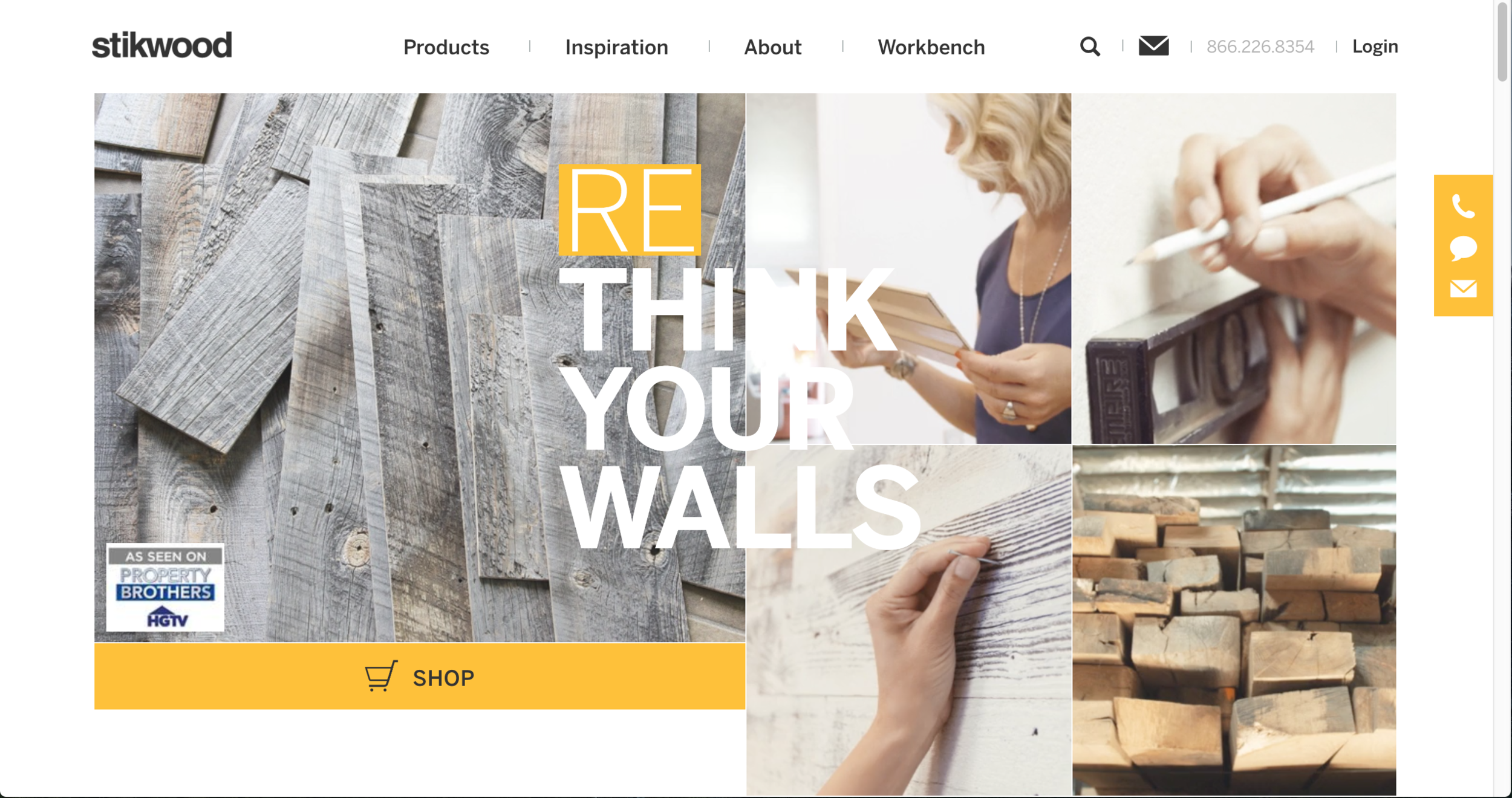
Stikwood uses GIFs in the hero section to help visualize how to install the product and to provide an effect of the quality of the result and ease of use.
Allbirds uses GIFs to playfully convey a feeling of softness and flexibility, which is the heart of their brand.

Both these sites use GIFs sparingly and effectively, in a way where it’s not overwhelming for users.
Lush takes advantages of GIFs as well, particularly on its product description pages.

Since this product is defined by the moment of immersion into the tub, that effect is translated on the product page. The speed of the video helps focus the user, as well as serves as a means to provide additional product scale.
So what’s the downfall of GIFs? Loading time. GIFs can use up a significant amount of data, so are best to be used wisely. It’s also important to have a balance of moving elements on the page. When multiple GIFs are playing in the same screen at once, this can cause an overstimulation and cognitive overload for the user. Sadly, if they don’t help convey a particular message, you probably don’t need them.
Unconventional Navigations
Navigation is one of the most important elements in supporting a proper user experience, as this is the primary means that allows users to easily move around the site. There are obvious pros of the navigation being at the top of the page, particularly because that’s where users are used to seeing it.
With the rise of the hamburger menu on mobile sites, many companies are using the hamburger for the desktop experience as well. Visually, this is a logical decision, as traditional navigation creates extra space on the main page- so if navigation contents are hidden, that allows for content or a background image to be uninterrupted.
So what’s the problem? Not only is the hamburger less discoverable, but it is also less efficient. Each time the user wants to navigate, an additional interaction is required to click on the hamburger. When it comes to eCommerce, hidden navigation is typically bad, especially for sites with layers of product inventory.
An exception to this rule is Tinker Watches, who take on a minimalistic approach to fully display their product, and utilize a hamburger menu.


In their case, this works better than it would on most eCommerce sites, as their inventory is many variations of essentially one single product. Products aren’t broken down into shopping categories- just size, finish, and strap filters that can be selected on the “Shop All” page. Users who are shopping on this site will likely not find the hamburger to be a buffer in navigating, as all products live in one place.
Protest has an original and effective navigation strategy where they use a combination of conventional navigation and hidden navigation.


“Men”, “Women”, and “Kids” product categories are displayed by default, and for kids, the subcategories are displayed on hover to show “boys”, “girls”, and “toddlers”.


Secondary information is contained within a hamburger menu. This helps prevent information overload from occurring and keeps the navigation approach minimal.
Many eCommerce sites are utilizing a method of a fixed navigation on the side or even bottom of the page. This is a great solution for desktop experiences, as users can navigate seamlessly without compromising the height of their viewport.
Paul Valentine, like Tinker, sells watches, with variations of size, color, style, and material. Because of their limited layers of product inventory and desire for simplicity, they use a hamburger menu for navigation as well.


Rather than placing the hamburger at the top of the page, it’s fixed on the side, and only appears once the user scrolls down, giving the hero area undivided attention on first view.
Bonobos takes an interesting approach to navigation, with a fixed side navigation.


This exposes all top-level product categories, and allows for a minimal header. The header is fixed as well in this case, resulting in an experience that occurs within an entirely fixed upside down “L” shape.
No matter what the navigation solution is, it’s important to consider user behaviors and motivations, for products to be intuitive and effortless to find.
More Minimalism
We described how pages are getting longer, but they’re also getting shorter. Minimalism is pretty much ubiquitous in design these days. With the influence of a growing mobile-first approach, as well as the popularization of wearables, websites are becoming stripped down too- particularly with the rise of a simple, sophisticated homepage that acts as a gateway for more information.
Zara’s experience is product and lifestyle focused, with single shots serving as a homepage slider.
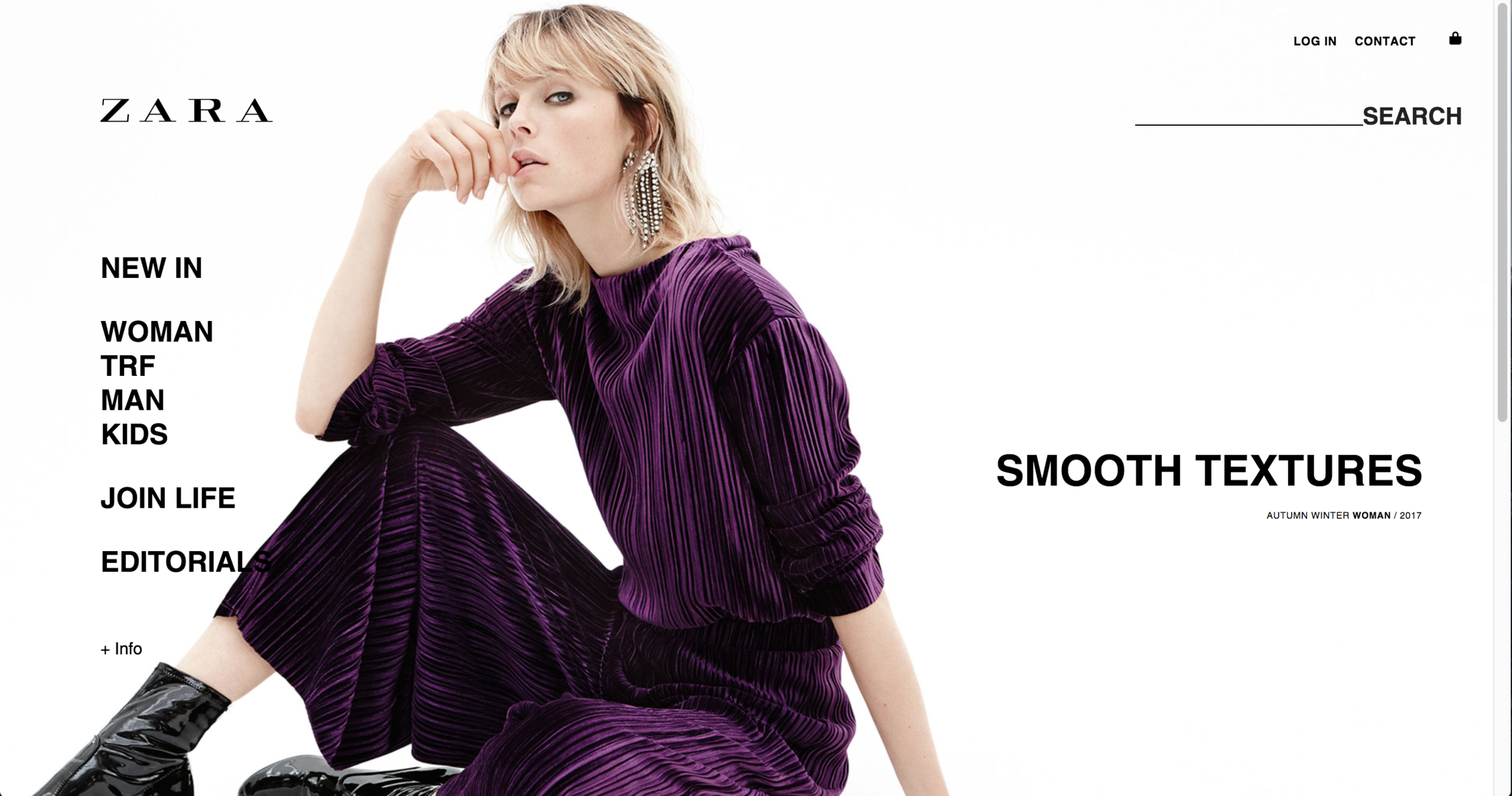
This single page, plus the fixed elements that make up the navigation and footer, serves as the central hub to everywhere else on the site.
The homepage for Tazo occupies just the size of the browser with 2 homepage elements: a hero slider and a line of products.

This keeps user attention in one place, and avoids the need for scrolling to occur.
Similar to the browser size of Tazo, Patagonia also gives no need for the user to scroll on the homepage, and leverages high-res lifestyle imagery.

Patagonia does less of guiding the user, and uses a simple navigation and header for them to find their own desired path through the experience.
Generally, people love simplicity, and do not want clutter, so this is a great solution right? Well, it’s tricky. When content and SEO information is living far below the scroll or on other pages, we need to make sure that users are being given enough information to find what they’re looking for, or to want to dig deeper.
Ghost Buttons
Related to the idea of minimalism are ghost buttons- those outlined buttons that aren’t filled in. As an effect of the minimalistic approach, ghost buttons appeared due to their neutrality. They are so aesthetically pleasing and are flexible, so their design can be used pretty much over any background image or color.
The downfall? They don’t offer much contrast at first glance, yet so many instances of ghost buttons are used as primary CTAs regardless.
Fitbit uses a ghost button as a primary call-to-action in their hero banner. This is likely not providing a lot of contrast to the button itself, and our guess would be that eye paths are moving to the product images instead. This could be either great or less ideal, depending on what the goals are for the experience.

Ghost buttons work best as secondary CTAs, to serve as the more neutral action.
Take GoPro, for example.

GoPro uses a primary “shop now” button, which is filled in, and a secondary “learn more” button, which acts more as a ghost button and offers less contrast, likely drawing more users to click “shop now”.
Ghost buttons are simple, modern, and fun, but when it’s a primary action or KPI for conversions, it’s important that the user can easily distinguish the button from other elements on the page.
Conversational Forms
With a greater interest in the human language and connecting with users, forms are seemingly turning into spaces for conversation, rather than a means for monotonous data entry.
Bouguessa utilizes a form-like input on their category pages in order to generate user interactions in product filtering.

Instead of using somewhat robotic language and categories and filters, the interface prompts the user to determine what they’re looking for in a MadLib-like format. This experience becomes more delightful, and offers a seemingly personal touch.
Clifbar does something similar, directly on their homepage.

The dropdown consolidates user tasks, desires, and motivations to guide them to the page or product they are likely looking for, providing a pleasurable interaction and reducing cognitive load on the users’ end.
Adam Underwear uses a conversational form in their footer in order to gather basic user data.

Engaging in first person, users are guided to complete their country of residence and language in a friendly and welcoming experience.
As 2018 rolls in, we’ll start to see even more shifts in trends, for better or worse. When new styles become introduced, it helps to remain strategic, and to think of them as other potential opportunities that can be used to solve very specific problems. It’s tempting latch onto trends or innovate further, but it’s more beneficial to ask, “will this help to solve the problem we are facing?”
As an agency that supports experimentation, we recommend conducting A/B tests to validate whether trends or unconventional practices will make or break the experience, and using heat mapping, scroll mapping, and other analytical tools to discover and learn how users are behaving. Of course, there are always exceptions to the rules- the key is knowing when to break them.