
Case Study
Raymour & Flanigan

Overview
Raymour & Flanigan is one of the largest furniture dealers in the Northeast, with 143 stores. The goal of this project was to redesign the ecommerce experience while putting customers first to eliminate the friction between physical and digital channels, as a foundational MVP to support a longer-term experience vision.
Customer & Competitor Research
During the Discovery phase, we dug deep into understanding the brand, the customers, and the competitive landscape. Research activities included:
Current state heuristic & user flow evaluation
Competitive analysis
Voice of customer interviews
Persona identification
Stakeholder workshop

Our research led to many key opportunities, one being to leverage the strength of having brick & mortar locations, while nurturing their online presence in order to better compete with those brands in that purely digital & marketplace space.
Key Opportunities
Elevate the brand experience
Showcase the brand to inspire an authentic lifestyle and clearly communicate differentiators
Eliminate friction in the transactional experience
All transactional parts of the experience from add to cart, to financing, to checkout, and delivery should feel integrated, seamless, guided, and frictionless
Support multi-channel customers
The shopping experience should feel fluid with a seamless handoff between in-store and online interactions
Improve product findability
With a user-centric information architecture strategy, guide the user down decision paths to support various scopes of shopping
Before and After
Homepage | Before
Product Listing | Before
Product Detail | Before


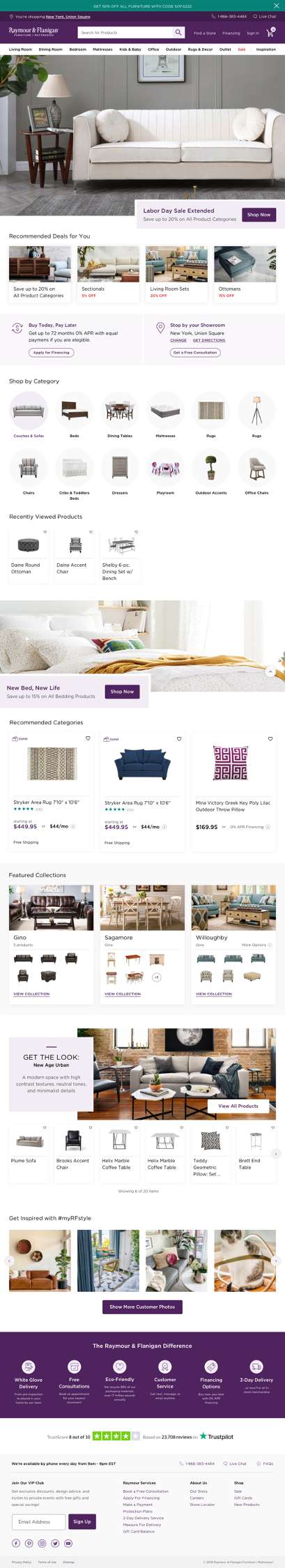
Homepage | After
Product Listing | After
Product Detail | After


Experience Enhancements
In addressing the key opportunities discovered within our research, we focused on the following website enhancements in order to optimize the user experience.
Collections
Previously, the presence of collections was unclear to the user. We designed Collection Cards to display a family of products through thumbnail images, so users can easily find visually similar products for their space.

Get The Look
To help push more of a lifestyle focus, Get The Look allows users to get a better sense of how items will feel together, across various collections

See It In Store
The notion of a brick & mortar presence is persistent in all phases of the customer journey from the Home page to Checkout, giving customers a reminder that they can visit a store at any point in their decision-making or buying experience

A Scalable Design System
We created an atomic design system for all of the website’s reusable components, further supporting the site’s rebranding efforts.
The New Experience
Please visit the redesigned website: Go to raymourflanigan.com